





























Cupons e promoções





Explore por categoria
Detalhes da oferta

Histórico de preços
| Loja e oferta | Preço | Indicação | Registrado em |
|---|---|---|---|
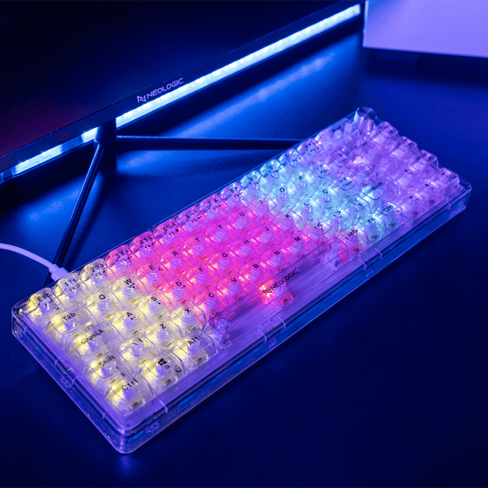
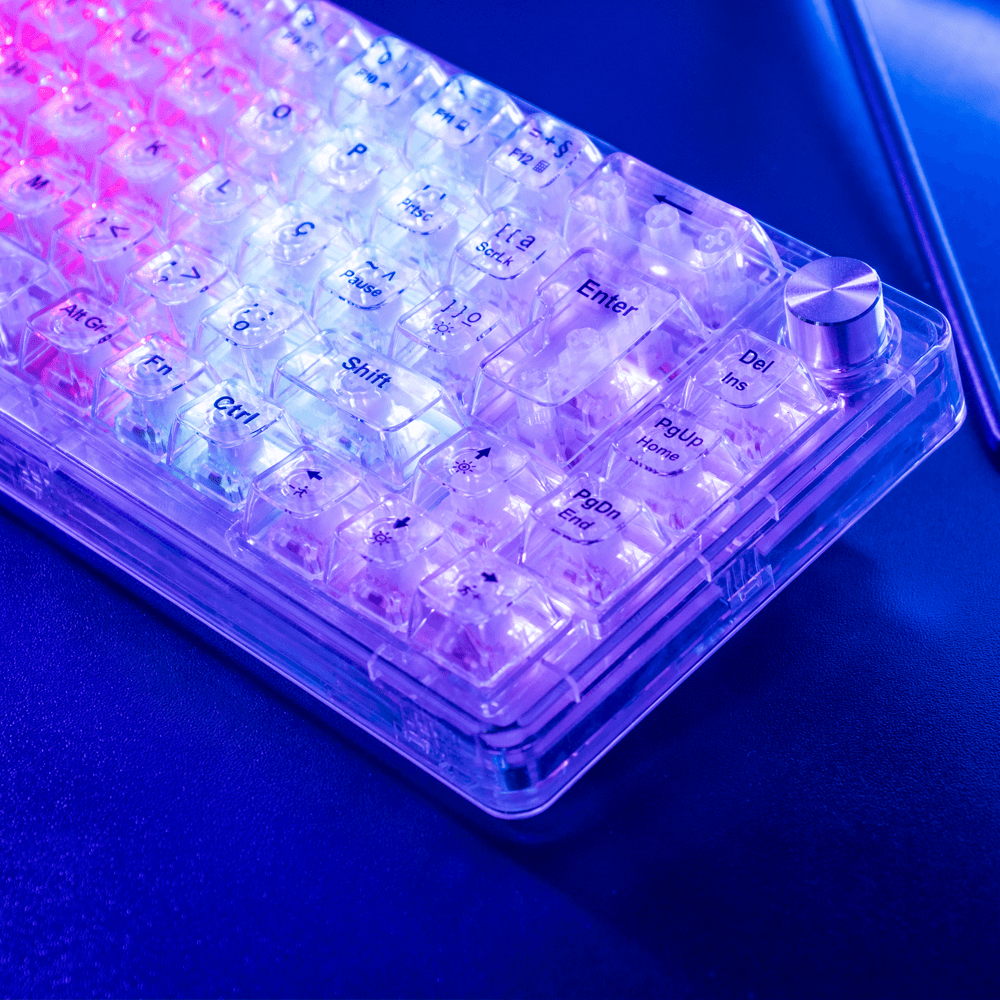
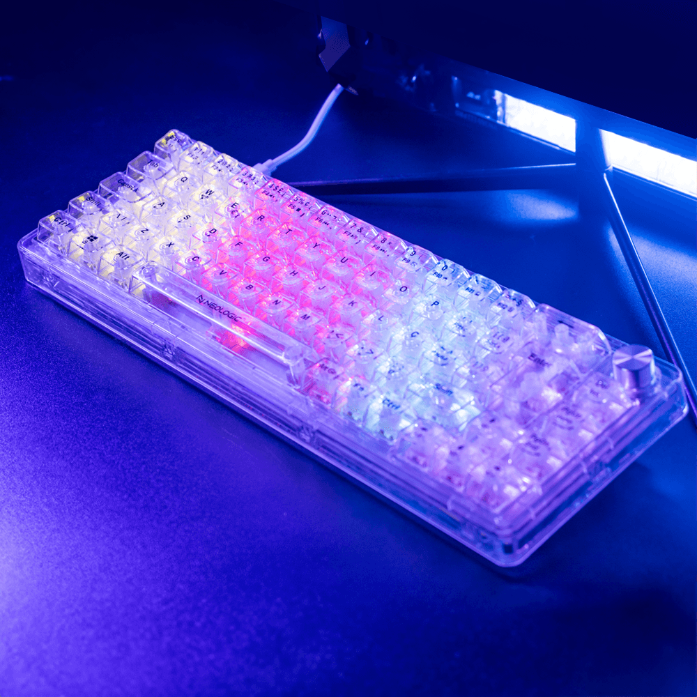
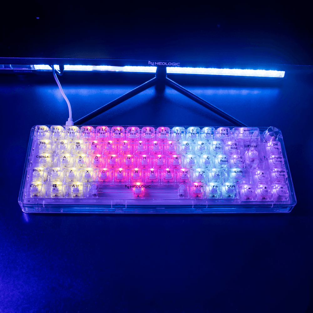
ShopinfoTeclado Gamer Mecânico Neologic Crystal Edge, 65%, Transparente, Rainbow, Switch Branco, Cabo Tipo C, ABNT2 - NLCRSTL-EDGEDescrição e condições.content-section-01 { background-image: url(https://shopinfo.vteximg.com.br/arquivos/desktop-crystaledge-bg1.jpg); background-position: center; background-repeat: no-repeat; background-size: cover; background-color: #070707; height: 124vh; display: grid; padding-bottom: 4em; } .content-section-02 { display: flex; justify-content: center; margin: 0 auto; background-color: #090909; } .content-section-03 { background-image: url(https://shopinfo.vteximg.com.br/arquivos/desktop-crystaledge-bg3.jpg); background-position: center; background-repeat: no-repeat; background-size: cover; background-color: #070707; height: 70vh; display: grid; padding-bottom: 4em; } .content-section-04 { display: flex; flex-direction: column; justify-content: center; margin: 0 auto; background-color: #090909; } .content-section-01 div, .content-section-03 div { display: flex; justify-content: center; margin: auto; padding-top: 0em; } .content-section-01 div img { height: 35em; } .content-section-01 .logo-prin img { height: 10em; padding-bottom: 10em; } .content-section-02 .org-info { display: grid; grid-template-columns: 1.2fr 1fr; gap: 8em; padding: 3em; width: 70%; } .content-section-02 .content-texts p { font-size: 15pt; } .content-section-02 .content-imgs { display: flex; justify-content: space-between; justify-content: center; align-items: center; } .content-section-02 .content-imgs img { margin-left: 0.5em; margin-right: 0.5em; } .content-section-02 .content-imgs div p { text-align: center; } .content-section-03 div img { height: 25em; } .content-section-03 div { padding-top: 0em; } .none-text { position: relative; z-index: -999; } .postion-text { position: relative; top: -36px; } .content-section-04 .org-info { display: grid; grid-template-columns: 1.2fr 1fr; gap: 8em; padding: 3em; width: 70%; margin: 0 auto; padding-top: 5em; } .content-section-04 .content-texts p { font-size: 15pt; } .content-section-04 .content-imgs { display: flex; justify-content: center; align-items: center; } .content-section-04 .content-imgs img { margin-left: 0.5em; margin-right: 0.5em; } .content-section-04 .content-imgs div p { text-align: center; } .content-section-04 .conten-img-center { display: flex; justify-content: center; } .content-section-04 .conten-img-center img { height: 2em; padding-bottom: 2em; } .content-section-04 .conten-end { display: flex; justify-content: space-around; margin: 0 auto; align-items: center; padding-top: 2em; } .content-section-04 .conten-end .img-tam { width: 27em; margin-right: 6em; } .content-section-04 .conten-end .img-tam2 { width: 15em; } .content-section-04 .img-org { display: flex; flex-direction: column; } @media only screen and (min-device-width: 1280px) and (max-device-width: 1280px) and (min-device-height: 720px) and (max-device-height: 720px) { .content-section-01 .logo-prin img { height: 7em; padding-bottom: 8em; } .content-section-01 div img { height: 25em; } .content-section-02 .org-info { display: grid; grid-template-columns: 1.2fr 1fr; gap: 3em; padding: 3em; width: 95%; } .content-section-02 .content-texts p { font-size: 13pt; } .content-section-03 div img { height: 16em; } .content-section-04 .org-info { display: grid; grid-template-columns: 1.2fr 1fr; gap: 8em; padding: 3em; width: 92%; margin: 0 auto; padding-top: 5em; } } @media only screen and (min-device-width: 1366px) and (max-device-width: 1366px) and (min-device-height: 768px) and (max-device-height: 768px) { .content-section-01 .logo-prin img { height: 7em; padding-bottom: 8em; } .content-section-01 div img { height: 25em; } .content-section-02 .org-info { display: grid; grid-template-columns: 1.2fr 1fr; gap: 3em; padding: 3em; width: 95%; } .content-section-02 .content-texts p { font-size: 13pt; } .content-section-03 div img { height: 16em; } .content-section-04 .org-info { display: grid; grid-template-columns: 1.2fr 1fr; gap: 8em; padding: 3em; width: 92%; margin: 0 auto; padding-top: 5em; } } @media only screen and (min-device-width: 1440px) and (max-devic | R$ 126,98 | Sheila Petnys |
Histórico de preços
Menor preço registradoR$ 126,98
Na Shopinfo · Registrado em
Registros desde até · janela de 90 dias.
Preço desta oferta igual ao menor registrado- Shopinfo · Sheila Petnys
Outras ofertas que você pode gostar
Informações da oferta
.content-section-01 { background-image: url(https://shopinfo.vteximg.com.br/arquivos/desktop-crystaledge-bg1.jpg); background-position: center; background-repeat: no-repeat; background-size: cover; background-color: #070707; height: 124vh; display: grid; padding-bottom: 4em; } .content-section-02 { display: flex; justify-content: center; margin: 0 auto; background-color: #090909; } .content-section-03 { background-image: url(https://shopinfo.vteximg.com.br/arquivos/desktop-crystaledge-bg3.jpg); background-position: center; background-repeat: no-repeat; background-size: cover; background-color: #070707; height: 70vh; display: grid; padding-bottom: 4em; } .content-section-04 { display: flex; flex-direction: column; justify-content: center; margin: 0 auto; background-color: #090909; } .content-section-01 div, .content-section-03 div { display: flex; justify-content: center; margin: auto; padding-top: 0em; } .content-section-01 div img { height: 35em; } .content-section-01 .logo-prin img { height: 10em; padding-bottom: 10em; } .content-section-02 .org-info { display: grid; grid-template-columns: 1.2fr 1fr; gap: 8em; padding: 3em; width: 70%; } .content-section-02 .content-texts p { font-size: 15pt; } .content-section-02 .content-imgs { display: flex; justify-content: space-between; justify-content: center; align-items: center; } .content-section-02 .content-imgs img { margin-left: 0.5em; margin-right: 0.5em; } .content-section-02 .content-imgs div p { text-align: center; } .content-section-03 div img { height: 25em; } .content-section-03 div { padding-top: 0em; } .none-text { position: relative; z-index: -999; } .postion-text { position: relative; top: -36px; } .content-section-04 .org-info { display: grid; grid-template-columns: 1.2fr 1fr; gap: 8em; padding: 3em; width: 70%; margin: 0 auto; padding-top: 5em; } .content-section-04 .content-texts p { font-size: 15pt; } .content-section-04 .content-imgs { display: flex; justify-content: center; align-items: center; } .content-section-04 .content-imgs img { margin-left: 0.5em; margin-right: 0.5em; } .content-section-04 .content-imgs div p { text-align: center; } .content-section-04 .conten-img-center { display: flex; justify-content: center; } .content-section-04 .conten-img-center img { height: 2em; padding-bottom: 2em; } .content-section-04 .conten-end { display: flex; justify-content: space-around; margin: 0 auto; align-items: center; padding-top: 2em; } .content-section-04 .conten-end .img-tam { width: 27em; margin-right: 6em; } .content-section-04 .conten-end .img-tam2 { width: 15em; } .content-section-04 .img-org { display: flex; flex-direction: column; } @media only screen and (min-device-width: 1280px) and (max-device-width: 1280px) and (min-device-height: 720px) and (max-device-height: 720px) { .content-section-01 .logo-prin img { height: 7em; padding-bottom: 8em; } .content-section-01 div img { height: 25em; } .content-section-02 .org-info { display: grid; grid-template-columns: 1.2fr 1fr; gap: 3em; padding: 3em; width: 95%; } .content-section-02 .content-texts p { font-size: 13pt; } .content-section-03 div img { height: 16em; } .content-section-04 .org-info { display: grid; grid-template-columns: 1.2fr 1fr; gap: 8em; padding: 3em; width: 92%; margin: 0 auto; padding-top: 5em; } } @media only screen and (min-device-width: 1366px) and (max-device-width: 1366px) and (min-device-height: 768px) and (max-device-height: 768px) { .content-section-01 .logo-prin img { height: 7em; padding-bottom: 8em; } .content-section-01 div img { height: 25em; } .content-section-02 .org-info { display: grid; grid-template-columns: 1.2fr 1fr; gap: 3em; padding: 3em; width: 95%; } .content-section-02 .content-texts p { font-size: 13pt; } .content-section-03 div img { height: 16em; } .content-section-04 .org-info { display: grid; grid-template-columns: 1.2fr 1fr; gap: 8em; padding: 3em; width: 92%; margin: 0 auto; padding-top: 5em; } } @media only screen and (min-device-width: 1440px) and (max-devic
Ver mais ofertas de ShopinfoCarregando mais indicações…
Tem uma dúvida sobre esta oferta? Pergunte à comunidade.